
SkillSuite Course Builder
USER EXPERIENCE AND VISUAL INTERFACE DESIGN
Experience and interface design for new course builder experience in SkillSuite software.
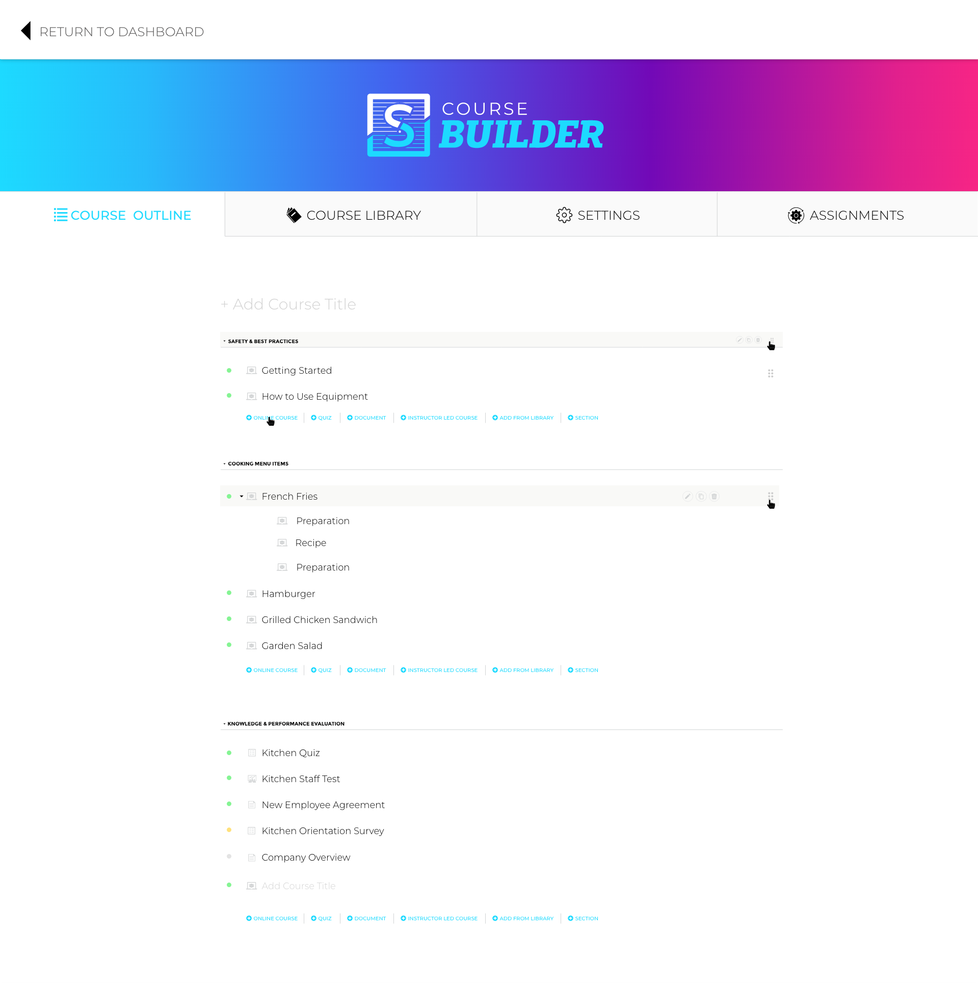
We redesigned the course builder for a simplified experience for ease-of-use and to allow more robust actions related to a course.
COMPANY OVERVIEW
SkillSuite is a training tool for business employees. SkillSuite helps businesses minimize the headache for training and employees and makes it easy for business leaders to share training materials and track employee progress.
THE TEAM
1 UX Designer, 6 Developers, 1 Product Owner

How did I have impact?
Developing product strategy and simple user research with stakeholders
Creating, developing, and presenting new user experience ideas
Designing interface, creating prototype, and doing usability testing
Worked closely with developers to ensure high quality work
What was the problem?
The features related to creating and assigning a course were separated into different areas of the software, making it hard for users to know how they were connected and how to properly create and enroll users in a course.

Proposed solutions to the problem
After observing confusion about how different product features correlated to each other, I concluded that simplifying the experience would make it easier for users to create and assign courses.
Separate section for each course element
Simplified Course Builder
Renamining of terminology:
Tracks —> Courses
Sections —> Lessons

Not every situation allows for the ideal experience design process for a development team. I experienced the following challenges while working on this project:
Lack of User Research
A lack of user research before beginning to design the user experience can lead to some poor choices being made based on thoughts or opinions with proof of what a user actually needs.
Stakeholder Pushback
Oftentimes those who are emotionally invested in the project are so focused on what they think is important that they automatically assume they know what the user wants. When those wants don’t match up, it can result in wasted time and money.
Rushed Timelines
Rushing the design process can result in lower quality design and development because of not allowing the necessary time to think through any potential problems or properly test ideas.
Lack of Roadmapping
Skipping the original standard process of long-term roadmapping for a product can often result in wasted time and money because of lack of planning for the long term goals of a product.
Experience Design


Proposed solutions to the problem
Zach, CEO, builds a training course with various lessons and quizzes with ease.
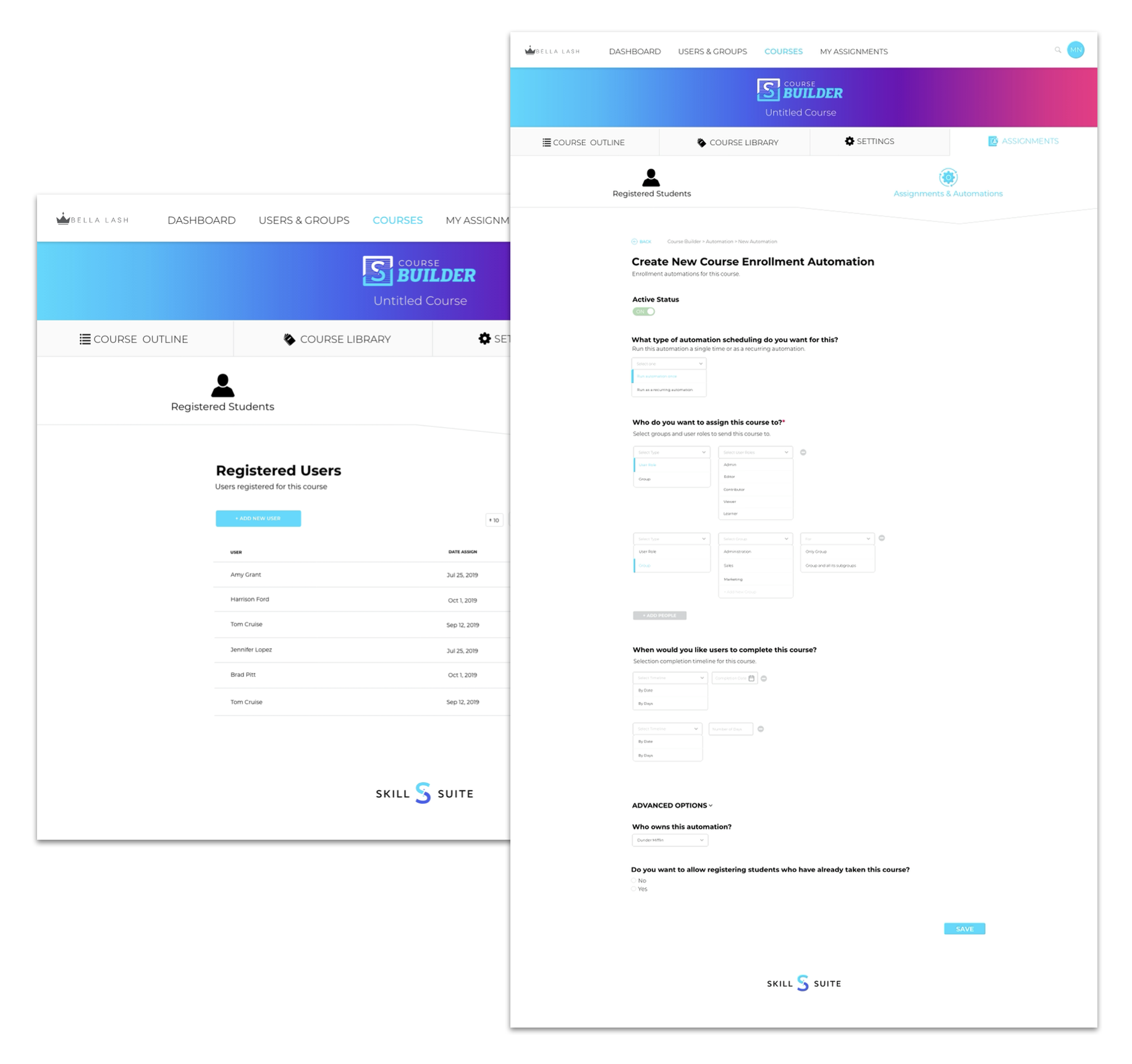
Kristi, the HR Manager, enrolls the company’s new employees in a New Employee Training course without having to leave the course builder.
How did it improve?
Business administrators and managers can easily create a course and enroll their employees in one place.
Having everything located in the Course Builder eliminates any risk of confusion on how to build a course and enroll users.


How did it do?
The new simplified course builder has proven to be an improved user experience.
85% of users no longer struggled with how to successfully build a course and enroll users.
Simplified Process
Eliminated Confusion
More Course Enrollments
What did I learn?
I learned positive things and where there was room for improvement.
POSITIVE TAKEAWAYS
Terminology is important
More time and had not been rushed
Appropriate long term planning and roadmapping