
RedBag Mobile App

Problem #1
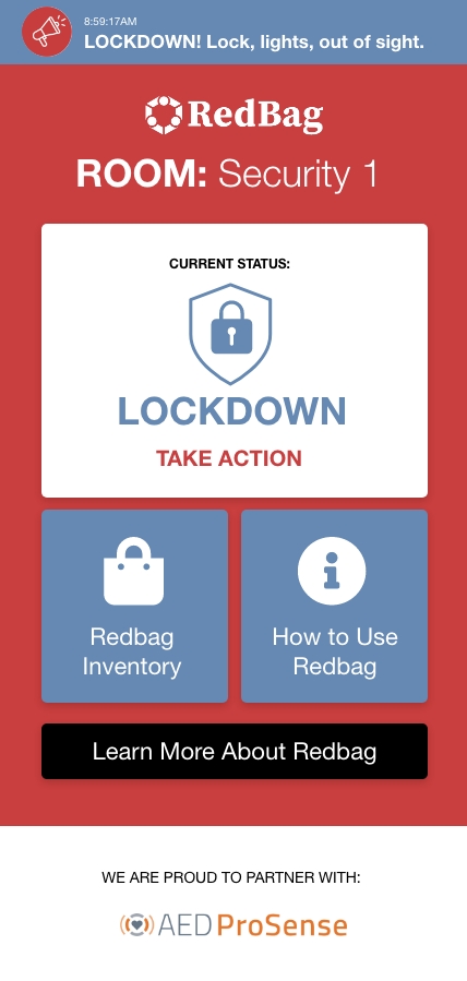
The dashboard page was clunky and not clear to users how to navigate to the pages that they need when in an emergency or drill.
Solution
Created a site that explained the features available in the software and what benefits it has for a business.
Problem #2
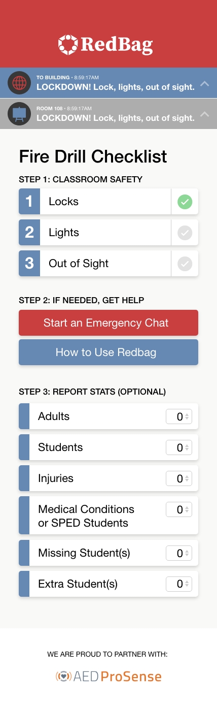
The room information page wasn’t laid out very well, and it was confusing to users as to what actions to take, in which order and with what priority.
Solution
Created sections for each step to make it clear what should be in done in case of emergency and in what order.
Step 1 includes a checklist to make it clear what actions to take.
Step 2 includes buttons for resources if help is need.
Step 3 includes an area to report the status of different students and the current needs.
Problem #3
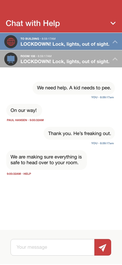
The chat feature flow wasn’t smooth, and the layout was jumbled and not clear as to who was communicating with who.
Solution
Designed the layout to match the branding colors, while also designing a way to differentiate who is talking to who by alternating alignment for speech bubbles and different colors to indicate the two different people involved in the conversation. Also included an easier way to know where to write your message and send it.
Problem #4
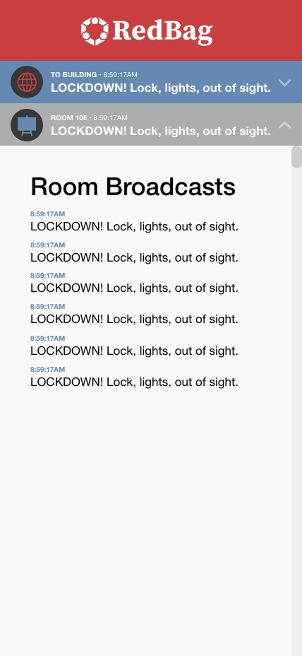
It wasn’t very clear how to differentiate between global broadcasts and room broadcasts.
Solution
Created different icons, colors, and labels to differentiate between general broadcasts and room broadcasts. Also cleaned up the layout so it’s clean and easy to read the history of broadcasts.