RedBag Mobile App
USER EXPERIENCE AND VISUAL INTERFACE DESIGN
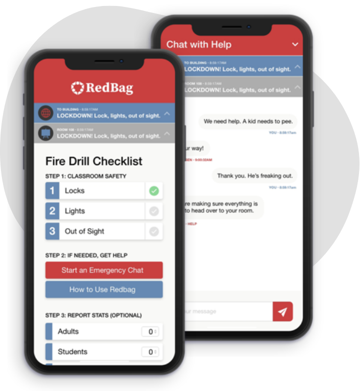
We improved the user experience and cleaned up the interface design for the mobile app.
COMPANY OVERVIEW
RedBag Technologies is an emergency kit coupled with an online app communication tool designed to be used in times of critical emergencies.
THE TEAM
1 UX Designer, 6 Developers, 1 Product Owner
How did I have impact?
Developing product strategy and simple user research with stakeholders
Creating, developing, and presenting new user experience ideas
Designing interface, creating prototype, and doing usability testing
What was the problem?
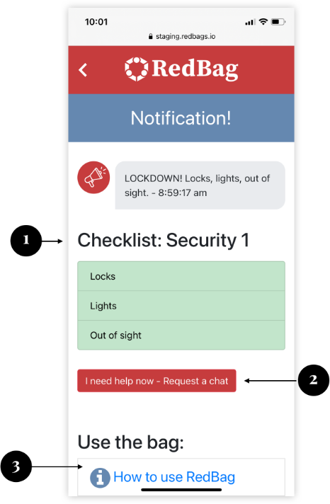
Stakeholders noticed that the essential
action items weren’t clear to teachers
in classroom.
RedBag saw a need to make the actions and resources clear through redesigning the mobile app.
Lacked clarity on how to ask for critical help in time of emergency.
Proposed solutions to the problem
Schools teachers in classrooms can quickly view the steps of the action items to complete during times of emergency.
optional resources separated made it more clear and
concise to schools teachers the step-by-step process
of what to do during an emergency.
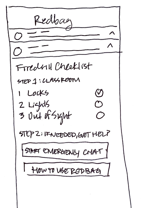
One comprehensive list
Just have everything listed out as one long list
Numbered list for action items
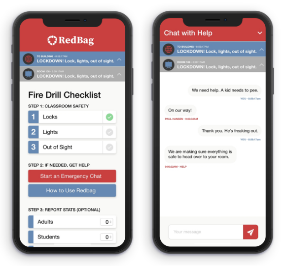
Step-by-step list for priority actions, and then separated area for emergency communication and help resources.
Experience Design
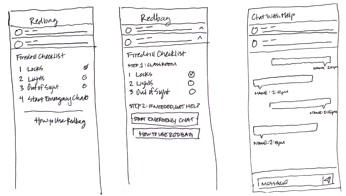
First, I mapped out the experience of teachers marking their classroom is safe.
Next, I mapped out the experience for the emergency chats and additional help resources.
Proposed solutions to the problem
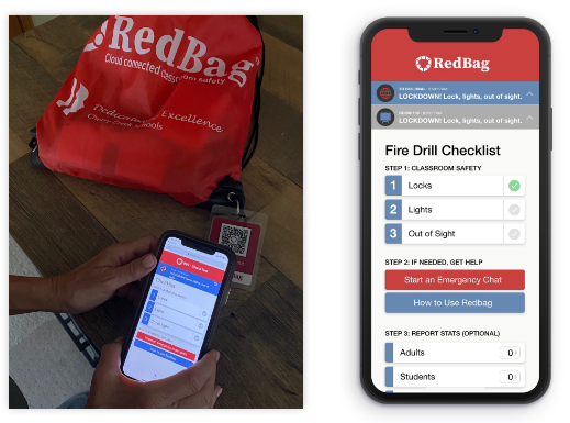
Lee-ann, School Teacher, uses the mobile app to mark her classroom have been marked as safe after having locked the doors, turning off the lights, and moving the students out of sight.
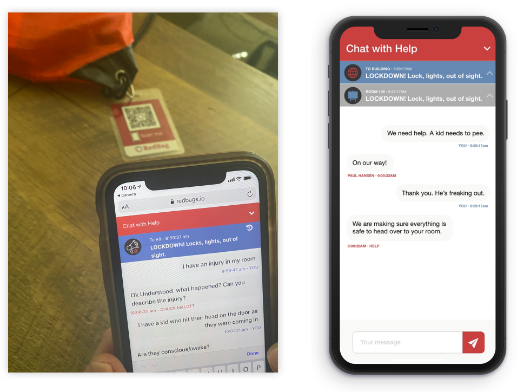
Erin, School Teacher, uses the mobile app to start an emergency chat with security and administration, asking for critical help for a student in danger.
How did it improve?
School teachers can more easily go through a checklist of action items during an emergency and feel less stressed about what they’re supposed to do.
Having it more clearly laid out step by step with checklists for completion left less room for error and made it more visually clear which items were priority and which ones were optional.
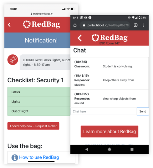
How did it do?
The mobile app design proved to be a useful user experience.
The redesign led to a very successful practice drill with the largest school district in Denver, Colorado, which created a lot of buzz and interest for other school districts.
This RedBag process is phenomenal and blows my mind. What an incredibly thoughtful and strategic process to help guide people in a potentially horrific situation. As a teacher, I feel so much more secure and supported in helping keep my students safe.
This RedBag process is phenomenal and blows my mind. What an incredibly thoughtful and strategic process to help guide people in a potentially horrific situation. As a teacher, I feel so much more secure and supported in helping keep my students safe.
What did I learn?
I learned positive things and saw great results.
POSITIVE TAKEAWAYS
Users like simplified and easy-to-see steps.
Make it clear what is essential and what is optional.
Being able to easily communicate with a chat feature is essential during a crisis, as well as know who you are communicating with.
RESULTS
Easier for teachers in classrooms to use with the steps broken down. They were no longer lost in the process.
Easier communication process with security staff.
More confidence in the staff during drills because it was clear to them what to do when an emergency strikes.
A very successful practice drill with the largest school district in Denver, Colorado.
