
SkillSuite Website

Problem #1
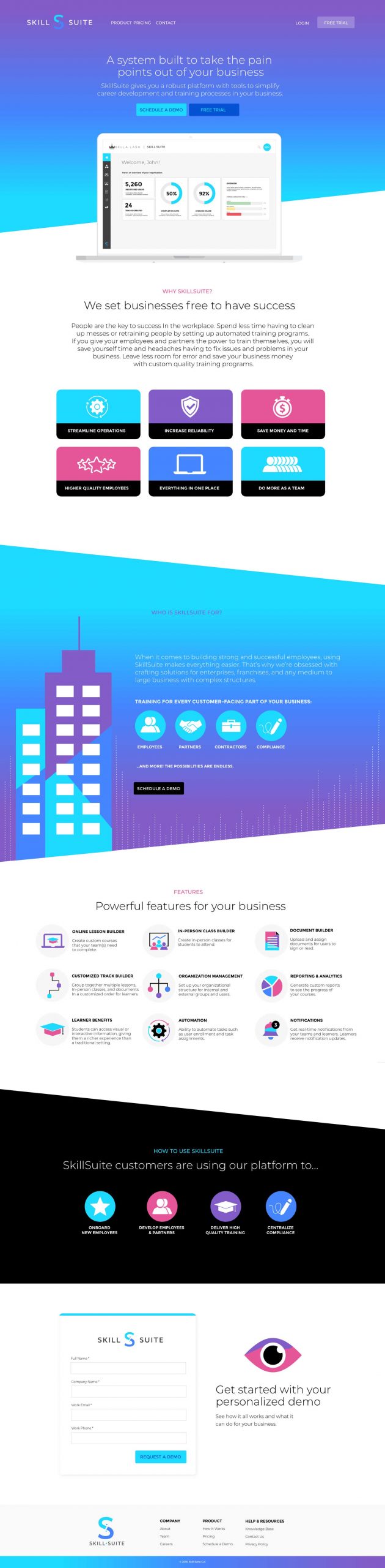
Simply put, we had no website, so we needed something that matched our branding.
Solution
Created a site that explained the features available in the software and what benefits it has for a business.
Problem #2
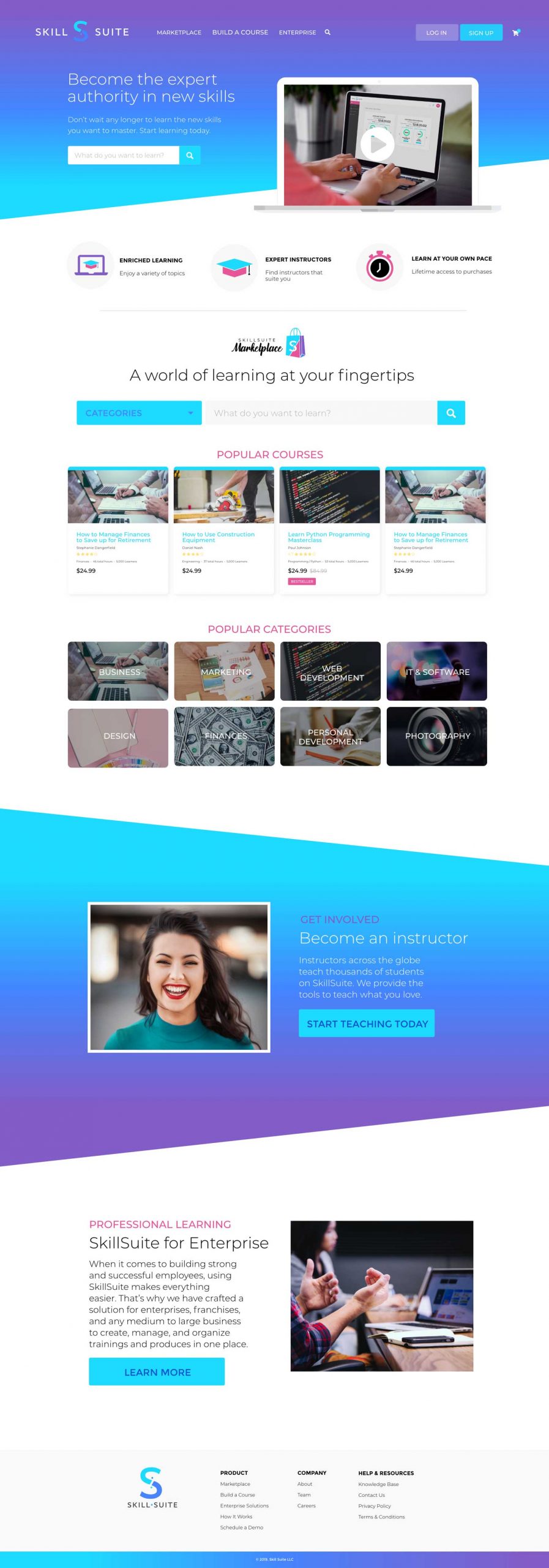
The previous version did not include a way to include the ability to purchase courses, if that concept was going to developed.
Solution
Modified the website to include a marketplace of courses that people can purchase.
Problem #3
The concept of the marketplace was tabled, so that was not developed. The bigger problem was the original version of the site was not very interactive or appealing to customers, so we needed to revampe the site to create more interest.
Solution
Designed a new homepage that is very interactive in terms of being able to click around and discover things. We included six different features from the software and built it out so that users could experience what it was like to use our software without having to actually be in it. And we also tried to better communicate what SkillSuite had to offer.


Problem #4
Visitors to the site were not realizing how interactive the site was and how they could play around with things. We also determined that we weren’t properly explaining how SkillSuite software solves their problems.
Solution
The site was redesigned to better communicate how the features of SkillSuite helps solves problems for a business owner. We removed the interactive features that were confusing to users and simplified the site and cleaned up the branded so that the CTA’s were more clear and drew more attention to the eye.